We went to the summer exhibition again, rather a treat, especially as we started with breakfast at Fortnum and Mason’s (very nice eggs benedict).
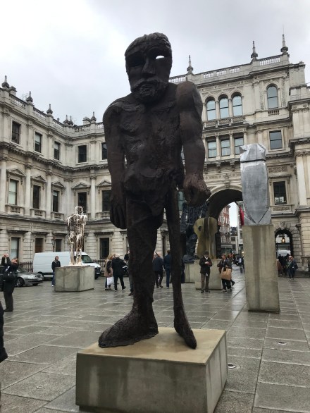
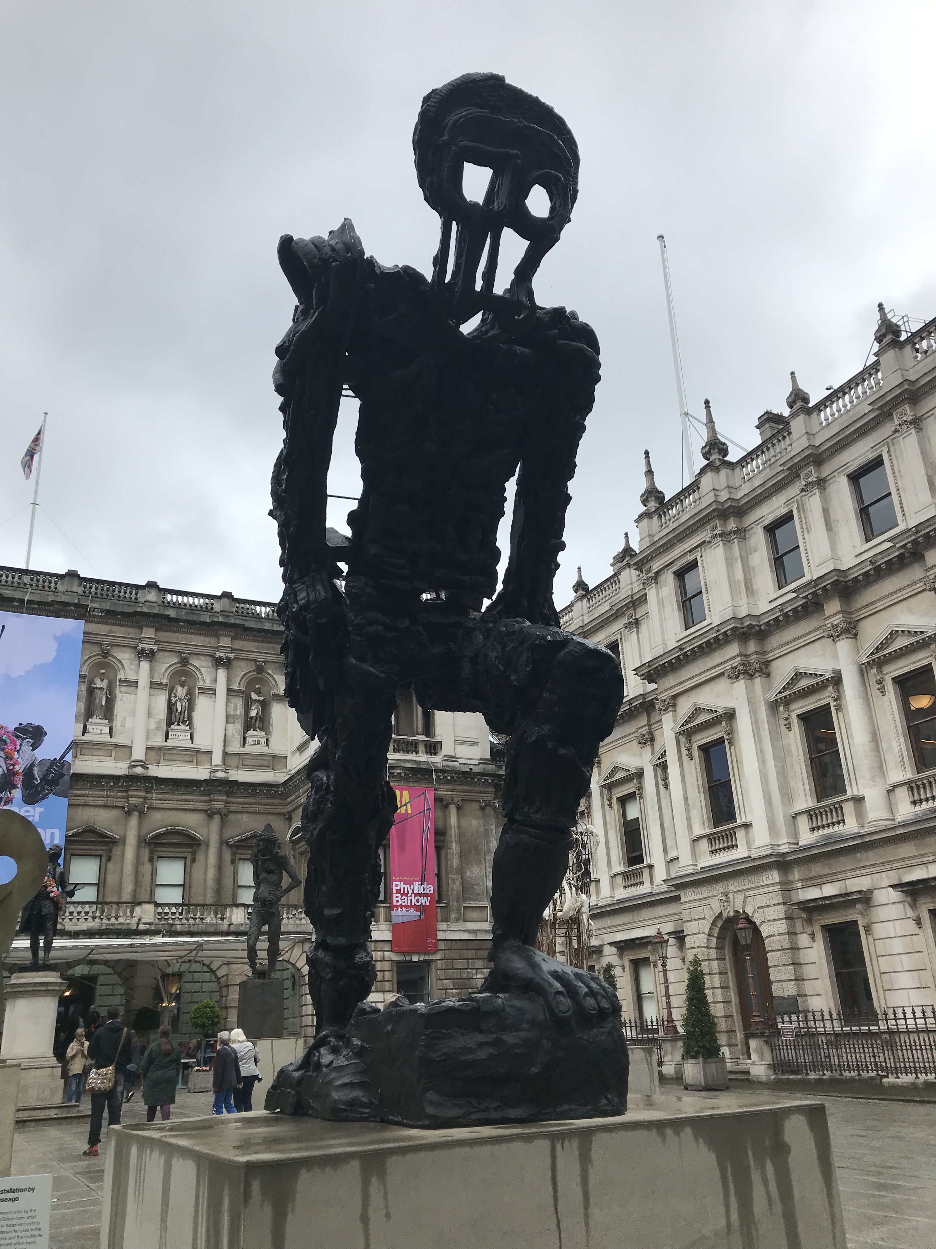
As we approached the royal academy, we were met by zombies. At least, they looked like zombies but we can’t be sure, as the sign which explained what the sculptures are was very highfaluting, and not at all understandable. In fact, this was bit of a criticism with all the signs around the exhibition—they were somewhat pretentious, the sort of signs that you read, twice, and then felt completely confused as to what they had actually said. Why they needed to write: “concerns of scale do not contain his ambition” when they could have written: “He likes making big things” is beyond me.
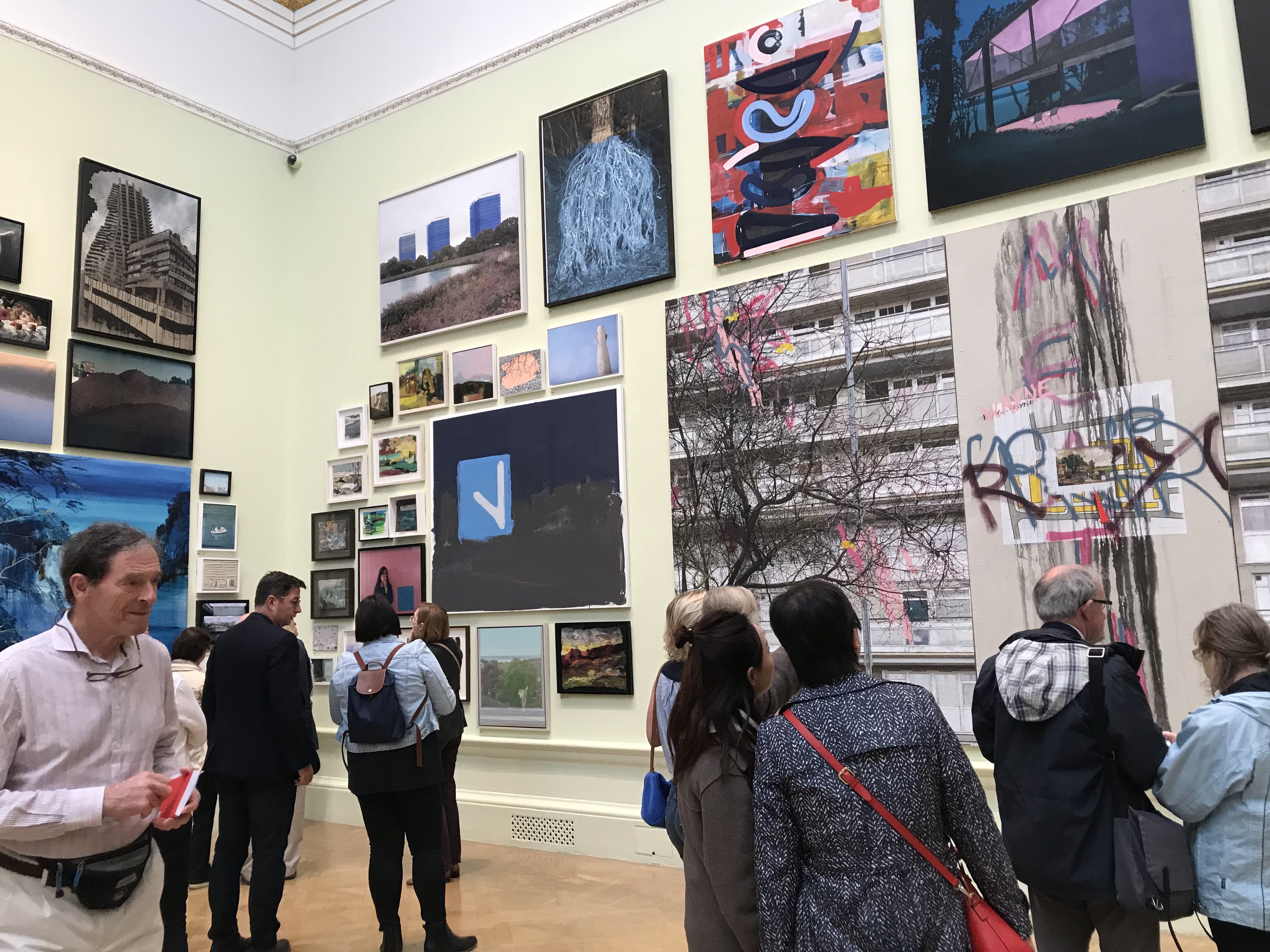
The exhibition was not, I felt, as flamboyant as last year’s, but it was still fun. Here are a few of my favourites:
I loved, of course, all the book-themed installations, especially ones which seemed to be showing how a story can be lifted from a book.

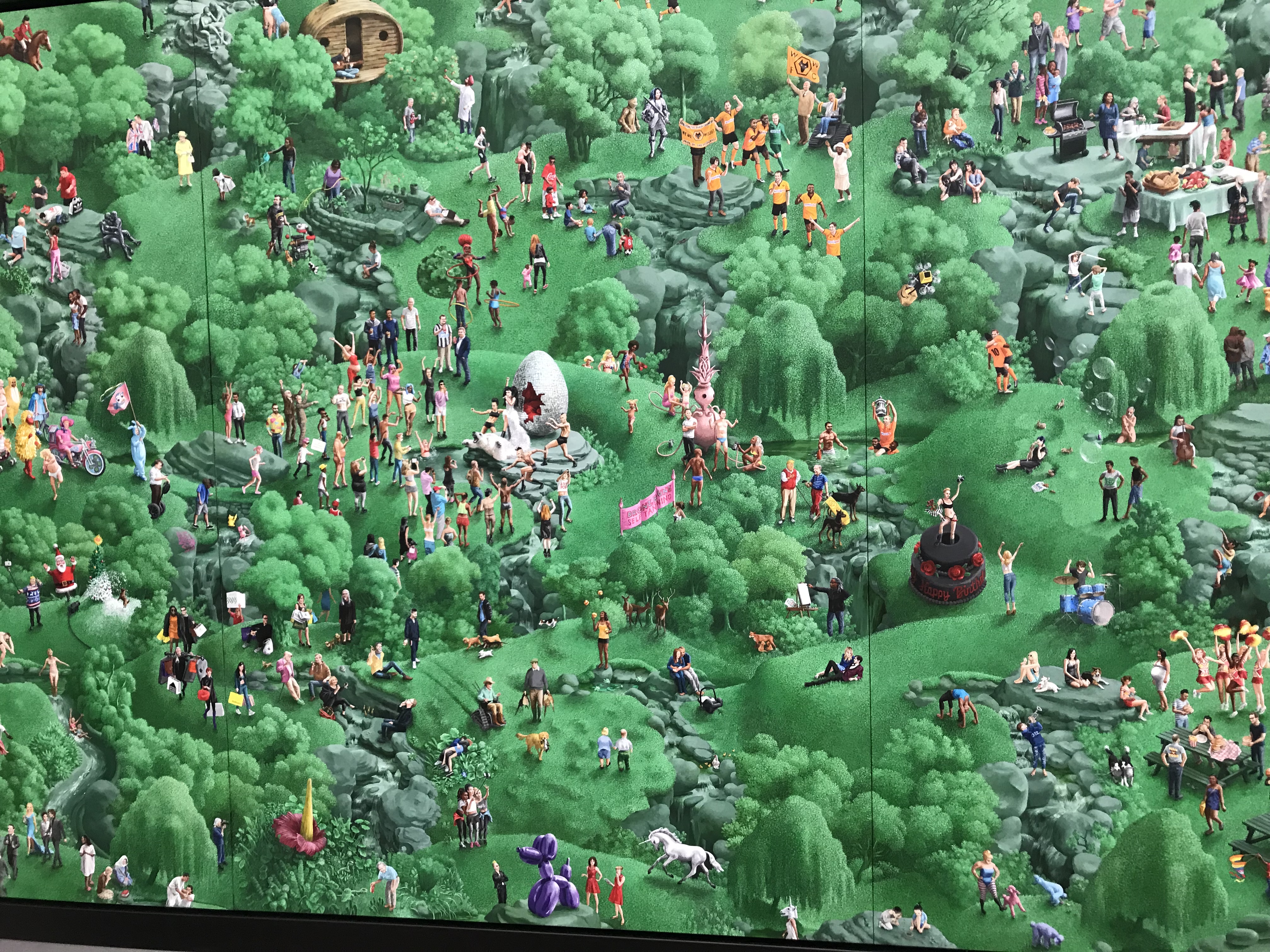
There was a sort of ‘Where’s Wally’ painting, full of famous people to find. As bit of a book nerd who doesn’t watch much telly, many of the characters were lost on me, but I did recognise a few. The painting as a whole had a sort of Central Park feel to it, and was rather fun.
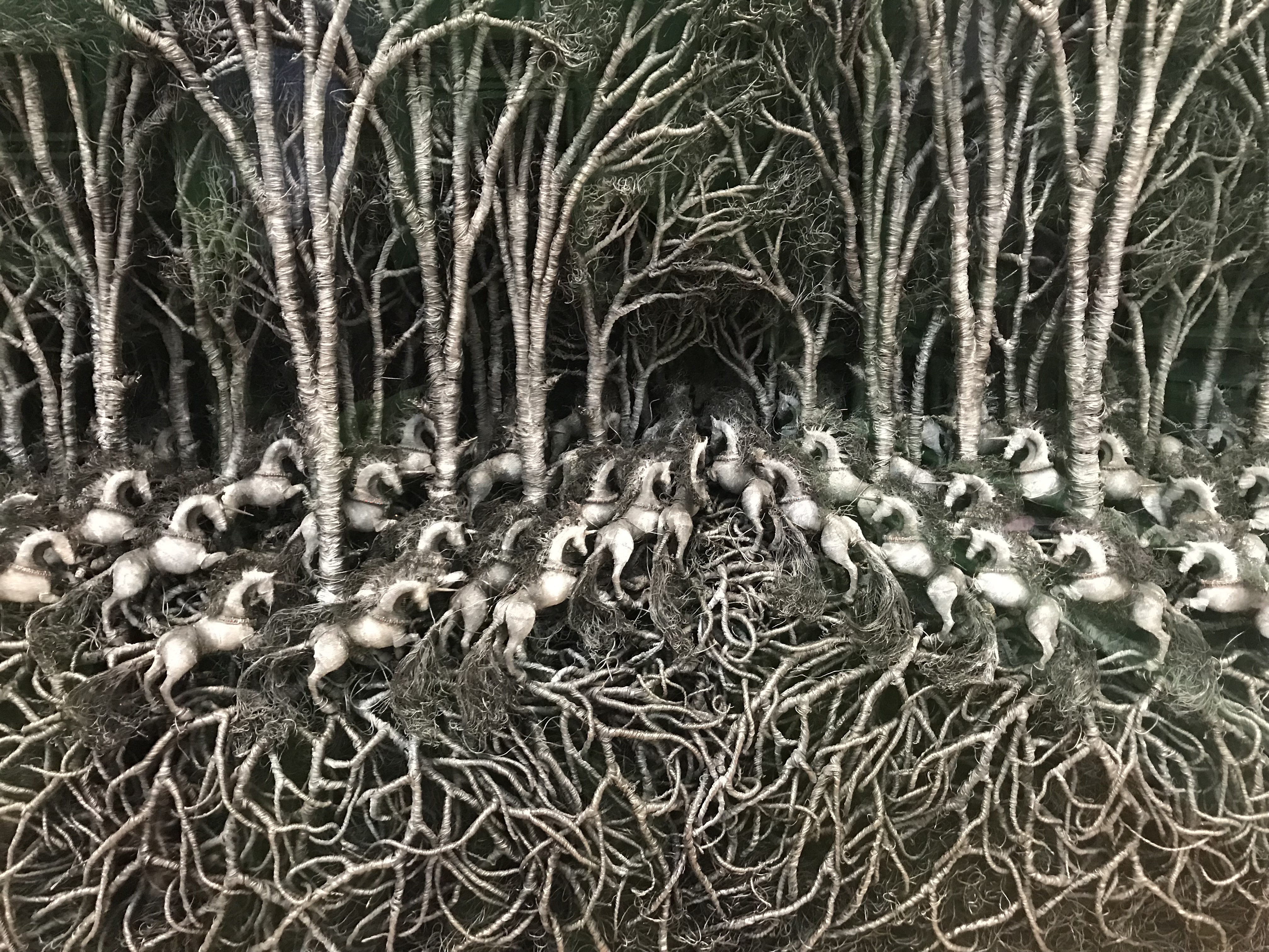
This forest of horses, made of wire, is lovely. I am almost certain that it is the exact same one which I enjoyed last year, which feels like cheating, but it’s still good.
This view of gardens is another one I loved. There is so much going on, and the painting sort of draws you into it.

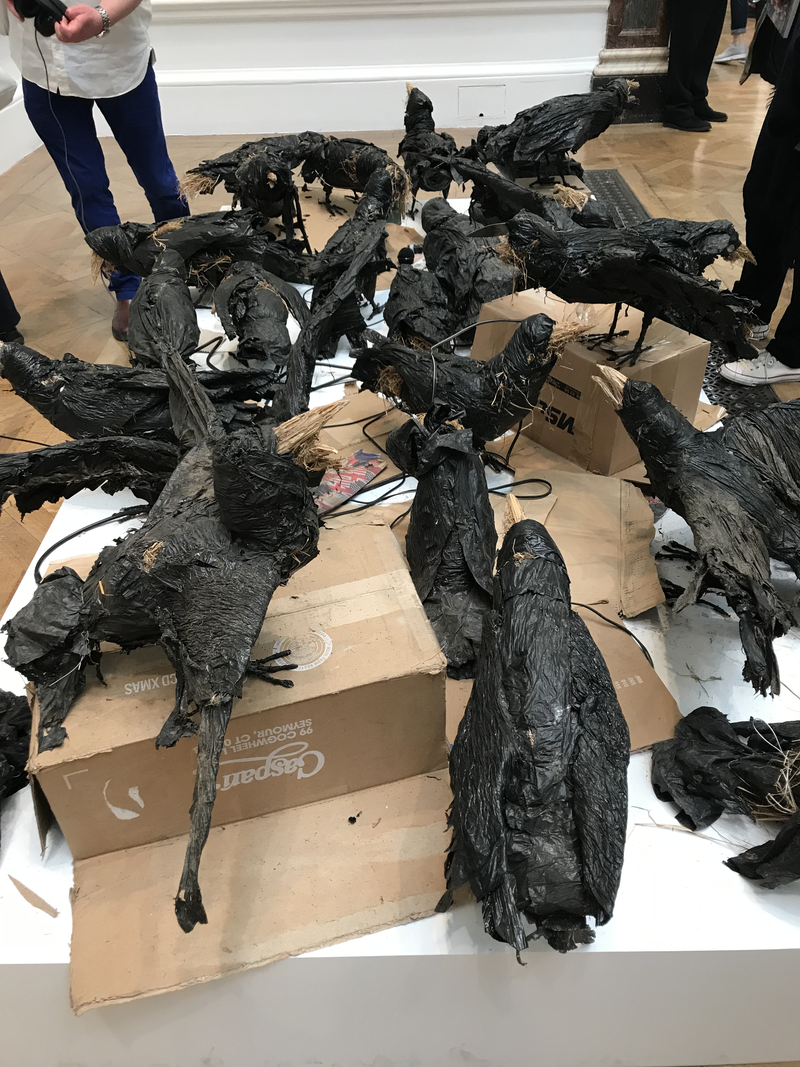
This photo is rubbish, so you’ll have to imagine, but the sculpture was of lots of crows, on upturned boxes. I can tell you that if you get too close and your coat brushes them, they wobble (but I don’t think you are supposed to do that). There are also headphones, with a soundtrack to listen to. I wouldn’t bother if I were you, it’s not very interesting, and I felt it was another bunch of words where the artist was ‘trying to be clever’ but it didn’t really work. I think perhaps I don’t much like how artists write.
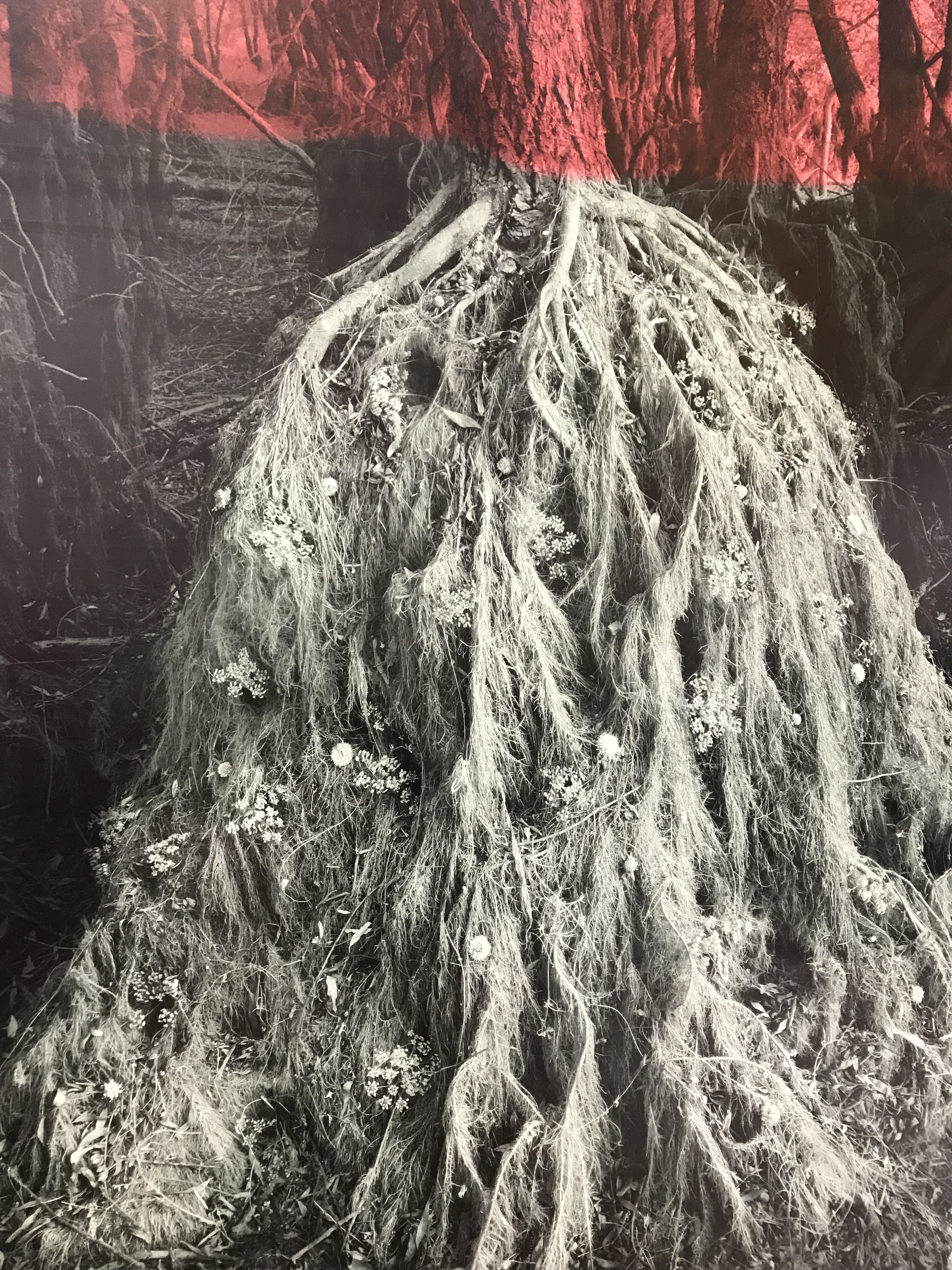
There were a couple of these pictures, with all sorts of flowers and textures growing in the roots of a tree. I couldn’t decide if the artist had created the image and then photographed it, or if they had merged several photos together. Either way, it was clever, and very pleasing to look at. I have no idea who the artist was (because I was too mean to buy a brochure) but I feel the artist was female, and young.
This polar bear on a hoop was in miniature in the entrance hall, and enlarged in another gallery. I think it was made with straw (and an old tyre) but it reminded me of shredded wheat. It had a rather friendly feel to it.

This was a painting, and was simply clever.

This was clever too. White blobs, which are somehow very pleasing to look at.

I love paintings which tell a story, and this one sort of entices you into it.
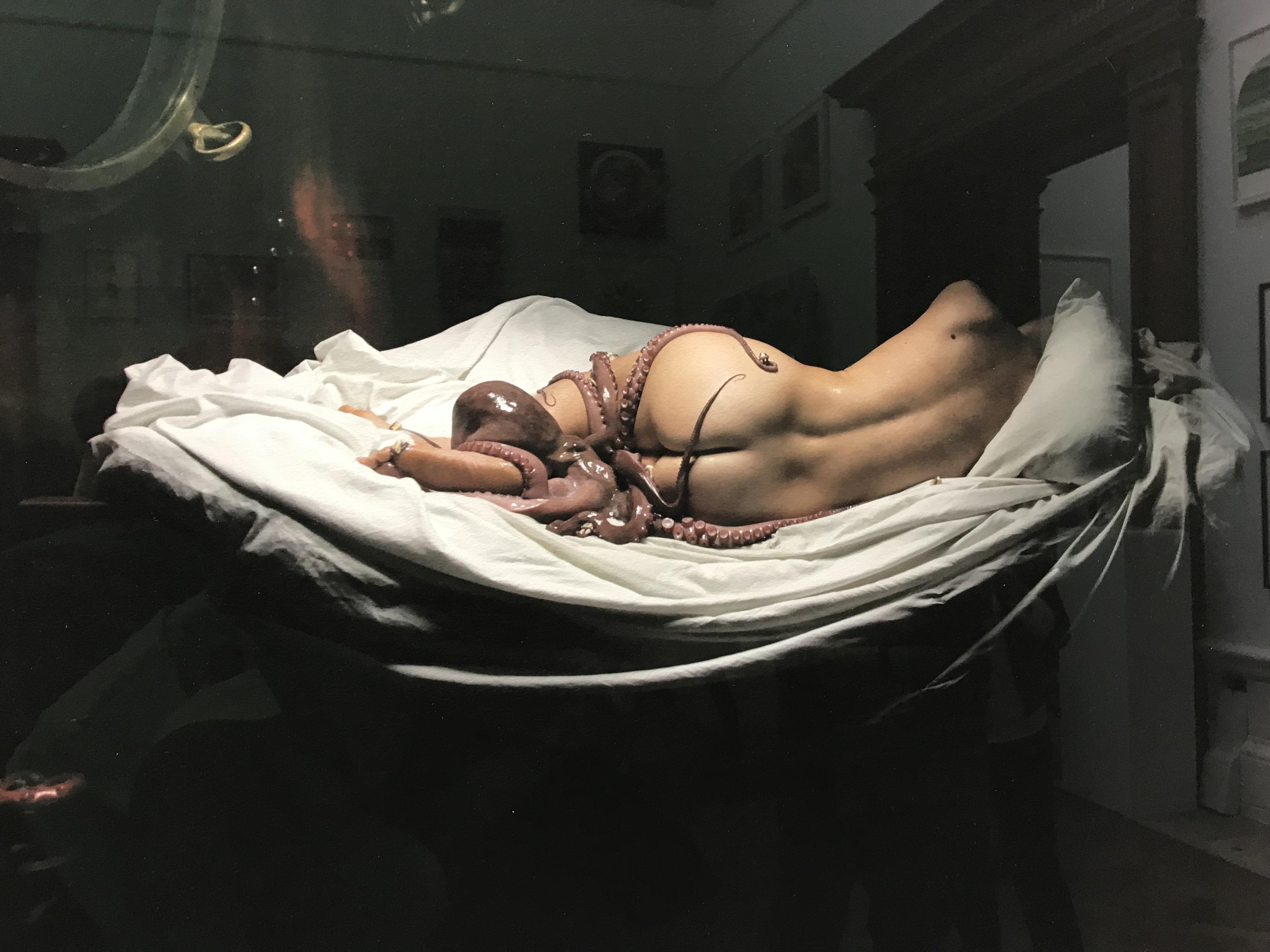
This photograph I love simply because I can imagine the conversation between the artist and the model. Did she know, when asked to strip off and lie down, that the artist was going to drape an octopus over her? Or did the artist pretend it was jewellery, or damp fabric, and it wasn’t until she saw the picture that she realised what the cold slimy thing was? (Made me chuckle, anyway!)
Of course, part of the fun of the summer exhibition is all the other people who go to see it. There are all sorts of people viewing the paintings, and you overhear all kinds of conversations (which are a great source of characters for your next novel!) As ever, I do have a few feedback points for the organisers, especially with regard to their lighting decisions, where they display some of the smaller works, and, most importantly, who they employ to write their signs. Should they ever decide to write information signs which actually impart information rather than confuse people (gosh, there’s a thought!) then I would be happy to help.
Thanks for reading.
Take care.
Love, Anne x
anneethompson.com


Spellbound. . .
LikeLike